Friday, March 13, 2009
A to Z Project Feedback
The commentary I received during class was very helpful. I am focusing on a very image based representation of the letters S, R, and J. It was hard for me to decide whether or not to keep these letters separated or to combine them in order to create a narrative. Ultimately, I think it will be better to separate the letters in order to make the history of the letters more clear to the viewer.
Sunday, March 8, 2009
Progress: Combining S, R, J

When I originally began work on this project I focused on each letter individually. I found the history and the associations very fascinating. As I have studied the letters "S", "R", and "J," it has become more apparent how the imagery surrounding each of them can be intertwined. I know that for this poster we are supposed to create something that shows the meaning and connotations of these letters as well as their graphical evolution.
I thought it was really interesting that both "S" and "R" are associated with threatening animals: a snake and specifically a growling dog, while "J" is associated with the hand, arm, and forearm showing strength and force. So I have chosen to depict a scene that combines all of this. The early version of "S," which means tooth, is within the dog's mouth. I thought it would be interesting to incorporate the early versions of each letter as bones on the ground or other objects, which I have not added yet. Right now it is a very symbolic depiction of the letters and I want to add visual representations of "R" and "J" in some way so the viewer will be able to associate this poster with the letters more easily.
I thought it was really interesting that both "S" and "R" are associated with threatening animals: a snake and specifically a growling dog, while "J" is associated with the hand, arm, and forearm showing strength and force. So I have chosen to depict a scene that combines all of this. The early version of "S," which means tooth, is within the dog's mouth. I thought it would be interesting to incorporate the early versions of each letter as bones on the ground or other objects, which I have not added yet. Right now it is a very symbolic depiction of the letters and I want to add visual representations of "R" and "J" in some way so the viewer will be able to associate this poster with the letters more easily.
Artist Presentation 6: Jim Campbell
 "Interactive Hallucination"
I am fascinated with artists who can create startling installations as well as performance art and Jim Campbell does it all. While looking through the installation section of his work I came across a title that struck my eye: "Interactive Hallucination," 1998. The pictures intrigued me because I could distinguish a figure, but I was not sure what had been projected upon the people.
This interactive video installation mixes live imagery with images from videodisc and videotape. This creates a real sized, real time, distorted mirror effect on the monitor. The mirror sets the viewer on fire, and also puts a "virtual" woman in the reflection, who is not really in the room. Sometimes the woman observes the viewers passively and at other times her actions affect the virtual space.
The idea of having an hallucination is very frightening to me, but mixing that with watching yourself on fire is even more unsettling. I think it is extremely interesting that Campbell has created a work that really puts the viewer in an uncomfortable position. I am starting to realize that the art is the most powerful when the viewer can relate to it, when it makes them rethink an established idea or notion, and when their emotions are affected by the piece.
In placing the viewer directly within the work of art they cannot help but relate to it. Once they are the subject of the work and forcibly having an hallucination then it is hard not to think about their ideas surrounding fire, death, and their relationships with others. The fact that there is a woman who is placed within the space who either reacts to the viewer or not is extremely influential. The viewer cannot help but feel, at least, simulated fear while the woman screams because they are on fire or anger if she does not react and ignores the viewer.
Critique: Journey Project
This project interested me from the beginning because I had been trying to think of a way that I could use my photographs from Oxford to specifically recall the feelings and thoughts that I had during the everyday walks and conversations I experienced. When I displayed my work in class I thought the feedback was very helpful. The parallel journeys I created were a walk through Oxford from my flat to the dining hall and back again and the thoughts and associations that were going through my head at the time. When I first presented my project to the class it was still a work in progress. I wanted to incorporate music within my project, but I did not want it to be within rollovers. I took the suggestion from Pat and made a clear link on the first page (the closet) to "Sex on Fire" and a link on the last page (Ludacris and the red light district) to "Get Back" so the viewer could listen to a little bit of the songs or ignore them completely if they chose. It was just another element to my thoughts within the journey.
It was pointed out during the critique that the rollovers within the textural images of the actual walk had a comic book quality to them because they were recognizable shapes and blatantly stood out to the viewer that they could either move on with the walk or take a look at either what I associated the real life image with or what I was usually thinking about those moments in time. This is what I was going for. After the critique, I added more rollovers with images within the less textural pages that represented my thoughts. This created a more imaginative space.
It was pointed out during the critique that the rollovers within the textural images of the actual walk had a comic book quality to them because they were recognizable shapes and blatantly stood out to the viewer that they could either move on with the walk or take a look at either what I associated the real life image with or what I was usually thinking about those moments in time. This is what I was going for. After the critique, I added more rollovers with images within the less textural pages that represented my thoughts. This created a more imaginative space.
Sunday, March 1, 2009
From A to Z Project Research
 "S"
"S"According to The Alphabet Abecedarium, "S" is the nineteenth letter of the English alphabet and the eighteenth letter of the Roman alphabet. It is descended from the Greek letter "sigma", which came from the Phoenician letter "shin." "Shin" is almost an exact replicate of how the letter "W" looks today. Nerdinger says that "S" is the displacement of split halves of the sun sign (similar to the yin yang) and stood for the summer solstice. Donald Anderson, on the other hand, believes that it descended from a pictogram depicting mountain peaks.
Plato's Cratylus states that the letter "sigma" is expressive of shaking and shock. The Romans were the ones who determined the shape of "S," displaying its changeable nature. "S" has been named "the serpent letter" because it is not of pure and unimpeachable character. Its sound can be likened to the hissing of a red hot poker that has been dipped in water just before falling silent. In Modern English, more words begin with "S" than any other letter. Poets have questioned if and how they should use this letter within their writing. Virginia Woolf wrote, "S is the serpent in the poet's Eden."
Within the Beth-luis-nion alphabet, the letter "saille" ("S"), is associated with the moon, monday, the lunar month (April 15), and the willow which is connected with witches and witchcraft and associated with Satan. In chemistry, "S" is the abbreviation for sulphur. The Romans used it as an abbreviation of salutem, "wishing health."
The meanings of "S" include: to chew, reduce, analyze, grind, crush, and shoot with a bow and arrow. The Mysteries of the Alphabet points out that there is also a "focus on the element of a barrier to the mouth, one that protects the entrance, a gatekeeper that can bite."
When I read that "S" was known as the serpent letter, I found a source image which depicted a snake in the shape of an "S." "S" depicts silence and because it is camouflaged as a snake, giving this idea even more precedence.
 "R"
"R"The Mysteries of the Alphabet says that "R" comes from the letter "resh," meaning the head or beginning. "Head" conveys the meaning of origin. There were some very interesting quotes concerning the letter "R," within this book, that caught my attention: "living is being born at every moment" and "...men have to die, but they are not born to die they are born to innovate."
The shape of the Hebrew letter "rosh" is taken directly from the hieroglyphic "head seen in profile" wearing a scarf. As time progresses, the scarf disappears as does the nose. As the letter made its transition to the Greek alphabet its direction changed
The derivative meanings of "r" include: brain, cranium, creation, create, begin, summit, head, to preside, to the end, new, first, branching, priority, and genesis. "Rosh," another letter that "R" is connected with, means "venom" and "poison." The Alphabet Abecedarium says that a capital "R" is like the shape of a growling dog's head. The form of this letter was thought to be ideal.
Therefore, I decided to use the image of a growling dogs head and a three dimensional "R" within its mouth to outline the similarity of shape and serve as something that the dog is trying to bite.
 "J"
"J"
The shape of the Hebrew letter "rosh" is taken directly from the hieroglyphic "head seen in profile" wearing a scarf. As time progresses, the scarf disappears as does the nose. As the letter made its transition to the Greek alphabet its direction changed
The derivative meanings of "r" include: brain, cranium, creation, create, begin, summit, head, to preside, to the end, new, first, branching, priority, and genesis. "Rosh," another letter that "R" is connected with, means "venom" and "poison." The Alphabet Abecedarium says that a capital "R" is like the shape of a growling dog's head. The form of this letter was thought to be ideal.
Therefore, I decided to use the image of a growling dogs head and a three dimensional "R" within its mouth to outline the similarity of shape and serve as something that the dog is trying to bite.
 "J"
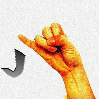
"J""J" is the tenth letter of the English alphabet, but I found out from The Alphabet Abecedarium that "J" is not in the ancient Roman alphabet. It is descended from "I" and thus comes from the Greek vowel "iota" and the semitic consonant "yod." The Mysteries of the Alphabet explains that "yod" is the hand and it is represented by a bundle of papyrus reeds or an extended arm with an upward facing open palm. It means to take, give, sleeve, and extension.
The original pictogram was borrowed from hieroglyphics that used a large number of variations based on the shape of the arm, forearm, and hand. There were depictions of holding bread; strength, force, effort, and violence; stopping; and negation. Canaanite inscriptions show it as a stylized hand while the Greeks reduced it further to three lines articulating the elbow and wrist, meaning to command. "J" is also linked with new life, soveriegnty, and christianity.
I thought it would be interesting to represent the letter "J" by using a hand that is already in the form of "J" in sign language because it is so closely related to the hand. I incorporated what looks like "J" from our alphabet as an arrow that explains the motion the hand must perform in order to sign "J."
Artist Presentation 5: Oleg Kulik
 "Big Milk"
  "Dog"
"Dog"  "Beremennaya"
I found Oleg Kulik's work in The Alternative Museum's exhibition Digitally Born- Digitally Manipulated Photographs. Fantasy is a prominent theme within Digitally Born. The artists have portrayed their imagination through the manipulation of these images. Fantasy is an element that often delights the viewer, but these works are alarming and provocative as well. Photography is often used to capture a more realistic portrayal, but these images push beyond what is immediate and perceptible. They make us question what is really being portrayed and our associations with the subjects.
Reality is ultimately the starting point for fantasy so it seems fitting that Kulik and the rest of the artists in this exhibition begin with photography. I really like how Kulik uses the repetition of the dog in all three of his works within this exhibition. He is using the dog to point out the essence of being human. In "Dog," by placing the dog in front of the family laying a golden egg, Kulik is referencing the fairytale of the goose laying the golden egg, which is a reference to greed. He seems to make a lot of allusions to allegories, commenting on the human psyche.
When I looked at the three images that Oleg Kulik has displayed I was most confused by "Beremennaya." The viewer is almost pushed up against the figure in the foreground on the right, who appears to be pregnant. On the bed in the background is another figure which is somewhat hidden and displayed at the same time, but still hard to read. The dog is in the center of the image looking slightly afraid. There is a vibrant red which is placed on an object on the ground. This object seems identical to what is between the legs of the figure on the bed. It was hard for me to decipher everything shown. Apparently, "beremennaya" means pregnant in Russian. I believe the artist wants the viewer to think about the origin of life and what it means to give birth, but it the way the dog is just placed in the photograph is kind of disconcerting because the tone of the image is not immediately apparent.
The way that Kulik uses three tries at presenting the dog in different ways and associating it with different aspects of being human is very interesting to me. With the letter project, I know that we are supposed to present three different approaches to similar imagery. Therefore, I found this recurring theme of the dog and Kulik's style very relevant.
Subscribe to:
Posts (Atom)